
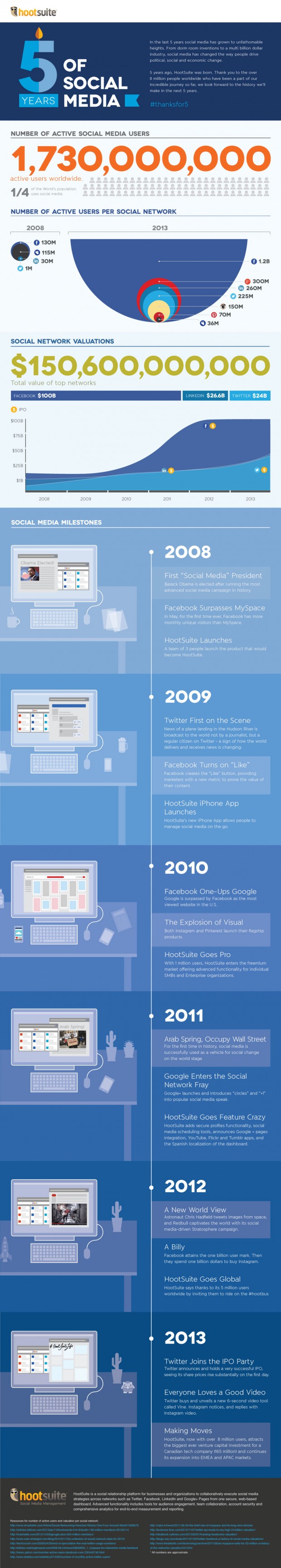
The infograhpic is very clear using different colors for for example active numbers of users and valuations on social networks. The decoration of the timeline of course adds to the shallowness of the infographic.
It has a very clear hierarchy with the users being in the top and then the value. Then it features a timeline which is almost its own infographic.
The timeline explains what has happened during the last five years in a very clear way. The designer used another color for this part of the infographic. The only thing, I think, would make it more clear, was if the designer had turned the timeline upside down so that it started with the year of 2013.
Here is another example on how to use different methods to tell the message.
No comments:
Post a Comment